ShopDreamUp AI ArtDreamUp
Deviation Actions


Suggested Deviants


Suggested Collections


You Might Like…


Description
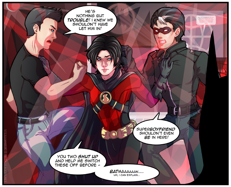
Watch me fuck around with continuity because Jason is ginger or something at this point? idk wtf, it's Bruce but I think that's fairly obvious right? How those two idiots set off the alarms - well, I reckon it has to do with trying to bash each other up over Timmy and probably smashing into a few things...It occurs to me that security much worse than whooping, flashing alarms should exist, but work with me here.
Thanks ~silencestation, as per usual, for the recommendations, help on the text, help on finishing and Batman.
Moaning about colouring and shit
Ah, my digital crutch and my colouring inefficiencies! Painstakenly gradient all parts, create and gradient a shading template, navigate the seas of two-directional lighting and then it all doesn't matter as I cover it in a swath of red beams everywhere.
It's a little deflating to colour my own stuff after I did 's Kon/Tim Red Robin and Iron Fist covers [THEY NEED MORE LOVE BY THE WAY] because though those took quite a while, they turned out very clean and effective. Good lineart helps a lot, of course. This one's kind of a mess, though sadly it was semi-intended; when I doodled it in class [that's ergo the terrible proportions] I imagined it more epically, like on a rooftop or something...then after deciding on a red overtone somehow the alarms seemed so much more hilarious with the stiff lineart. So be it!
Thanks ~silencestation, as per usual, for the recommendations, help on the text, help on finishing and Batman.
Moaning about colouring and shit
Ah, my digital crutch and my colouring inefficiencies! Painstakenly gradient all parts, create and gradient a shading template, navigate the seas of two-directional lighting and then it all doesn't matter as I cover it in a swath of red beams everywhere.
It's a little deflating to colour my own stuff after I did
's Kon/Tim Red Robin and Iron Fist covers [THEY NEED MORE LOVE BY THE WAY] because though those took quite a while, they turned out very clean and effective. Good lineart helps a lot, of course. This one's kind of a mess, though sadly it was semi-intended; when I doodled it in class [that's ergo the terrible proportions] I imagined it more epically, like on a rooftop or something...then after deciding on a red overtone somehow the alarms seemed so much more hilarious with the stiff lineart. So be it!Image size
800x648px 367.43 KB
© 2011 - 2024 stereophilic
Comments17
Join the community to add your comment. Already a deviant? Log In
Nice colors and drawing style. I love it  (Smile)") !!
!!